Scoring data from RFP / RFx projects is used in different ways by different organizations. It can be statistically manipulated, analyzed or used to produce charts and reports. To facilitate these activities PostRFP provides a way of exporting scoring data for maximum flexibility. This is the "Raw Data Export" report reached under Project -> Reports using the "Raw Data" link under "Analysis". This article describes using Excel's Pivot Table functionality to analyze data thus exported. The screenshot below shows how the sample dataset appears when it is first loaded in Excel:
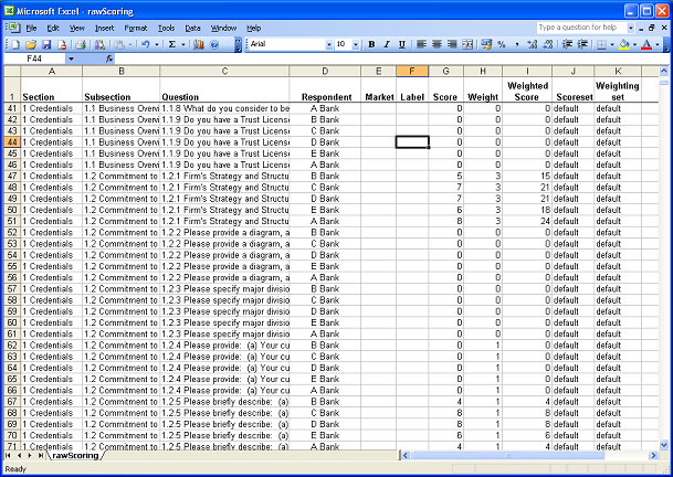
Note that to follow the steps in this article you need a questionnaire structured into Sections and Subsections. If this is not your case, then this article should give a fair overview in any case. One row corresponds to one respondent's answer to one question. Note that the same data is duplicated on many rows. For example, the Section Titles are repeated. This is correct for exporting to an OLAP style analysis tool. The data is said to be "denormalized" - ie data taken from a normalized SQL database is denormalized by dumping it all, with duplications, into a single file. Pivot Tables use this duplicated data to isolate values for grouping and aggregating data. The next step is to create a pivot table in Excel. Select a cell somewhere in the recently imported data, click the "Data" menu, and select "Pivot Table and Pivot Chart Report". This brings up the following Wizard:
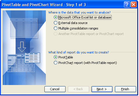
Select the default options for Step 1, as shown above. For Step 2, Excel should, by default, choose a range of values including all the data you have downloaded from PostRFP. If not, you will need to select the data yourself. For the final Step 3, the default option is to create the Pivot Table in a new Worksheet. This is the easiest and best option. Clicking "Finish" should bring to you a screen looking something like this:
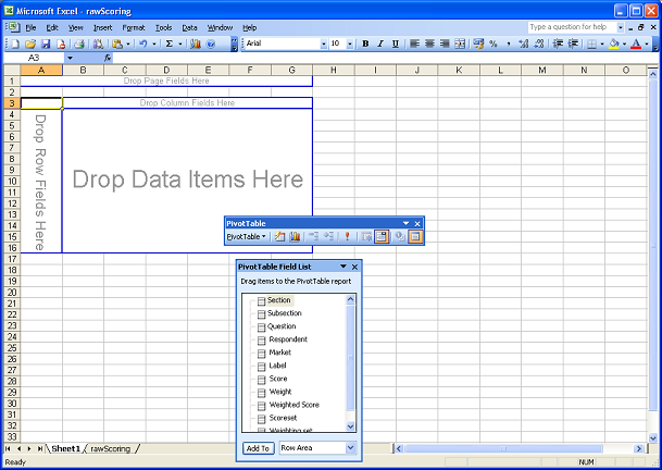
Note that the Field List corresponds to the Columns in the original data list. These Fields can now be dragged into the Pivot Table as either:
- Page Fields - to filter the data processed in the table
- Column Fields - grouping the data into columns
- Row Fields - grouping data by rows
- Data Item - this is the data that you want to analyze - generally either Score or Weighted Score.
To get started, try the following:
- Click on "Section" in the Field List and drag it into "Drop Page Fields Here"
- Drag "Subsection" from the Field List into "Row Fields"
- Drag "Respondent" into Column Fields
- Drag "Weighted Score" into "Drop Data Items Here"
Then click on the Drop Down arrow next to "Section" and select a Section. The data is now filtered. N.B. By default, Pivot Tables deal with Data Items by counting values - NOT by summing numbers. To change this behaviour, right click on a Data Item and select "Field Settings":
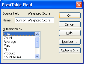
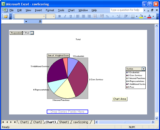
To see the Sum of Scores by Section, choose "Sum of Weighted Score". The Pivot is now Calculating total SubSection scores, by Respondent, for the Selected Section. The great thing about Pivot Tables is that it is incredibly easy to play around with your data, and to create new reports or views of it. Try dragging the Fields (Section, Score) etc around the Pivot Table, and see how it responds. Pivot Tables can also produce Charts in a similar way - just click the Chart icon in the Pivot Table menu, drag around Fields and produce charts like the following, which allows you to pick a respondent and then view the distribution of their scores across sections as a Pie Chart:
Excel's Pivot Tables are a very powerful yet convenient way of analyzing large datasets. We hope this article will help users unfamiliar with Pivot Tables to benefit from them.
Comments